Brand Identity​

WE WAlK
Category:
Brand Identity
Date:
January - December 2021
Client:
We Walk

Project Overview

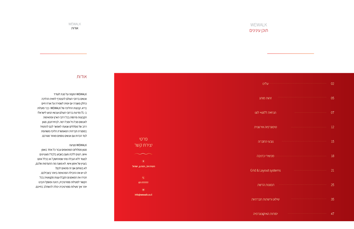
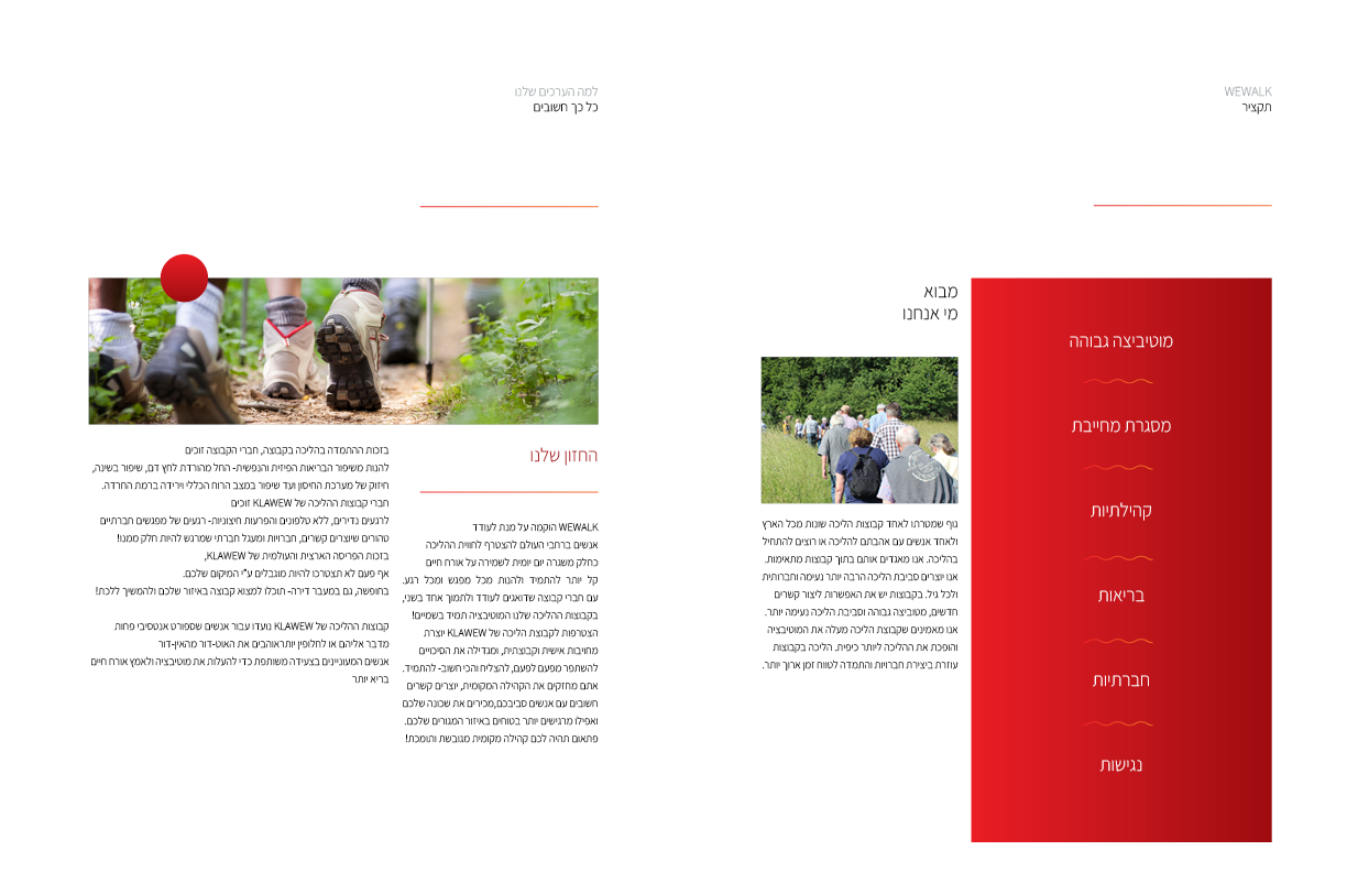
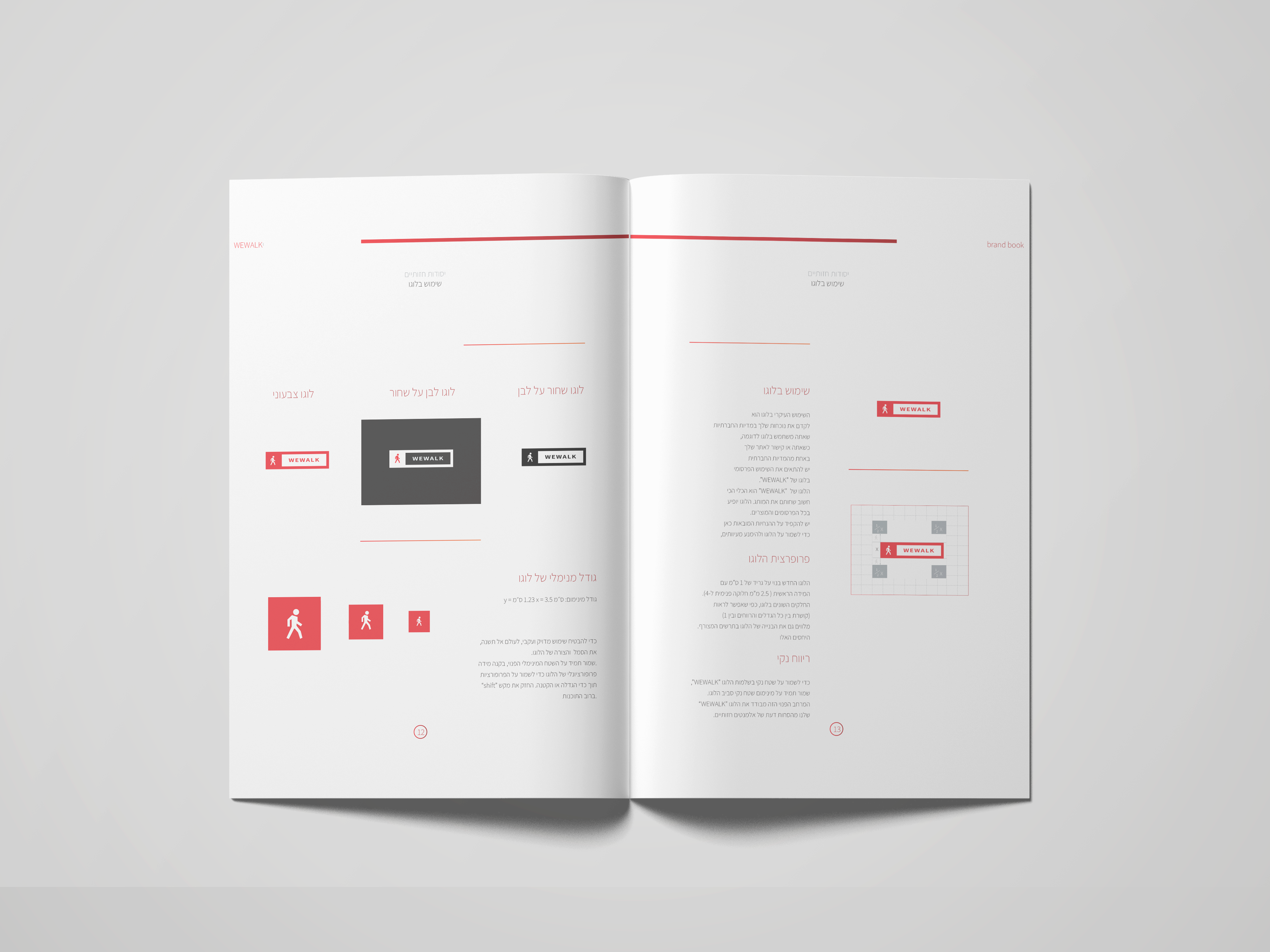
WEWALK’s brand identity project aimed to establish a cohesive and inspiring visual language that resonated with its mission to connect people through fitness and community. The challenge was to design a visual identity that captured the spirit of motivation and togetherness of the customers and the brand while ensuring a consistent and appealing design.

Understanding The Problem

The brand needed to differentiate itself in a crowded marketplace by creating a memorable and authentic identity. Key themes included communicating the brand’s core values ​​– community, wellness and accessibility – while maintaining a professional yet approachable tone. Additionally, the hierarchy of information needed to balance clarity with visual appeal.

Designing The Solution

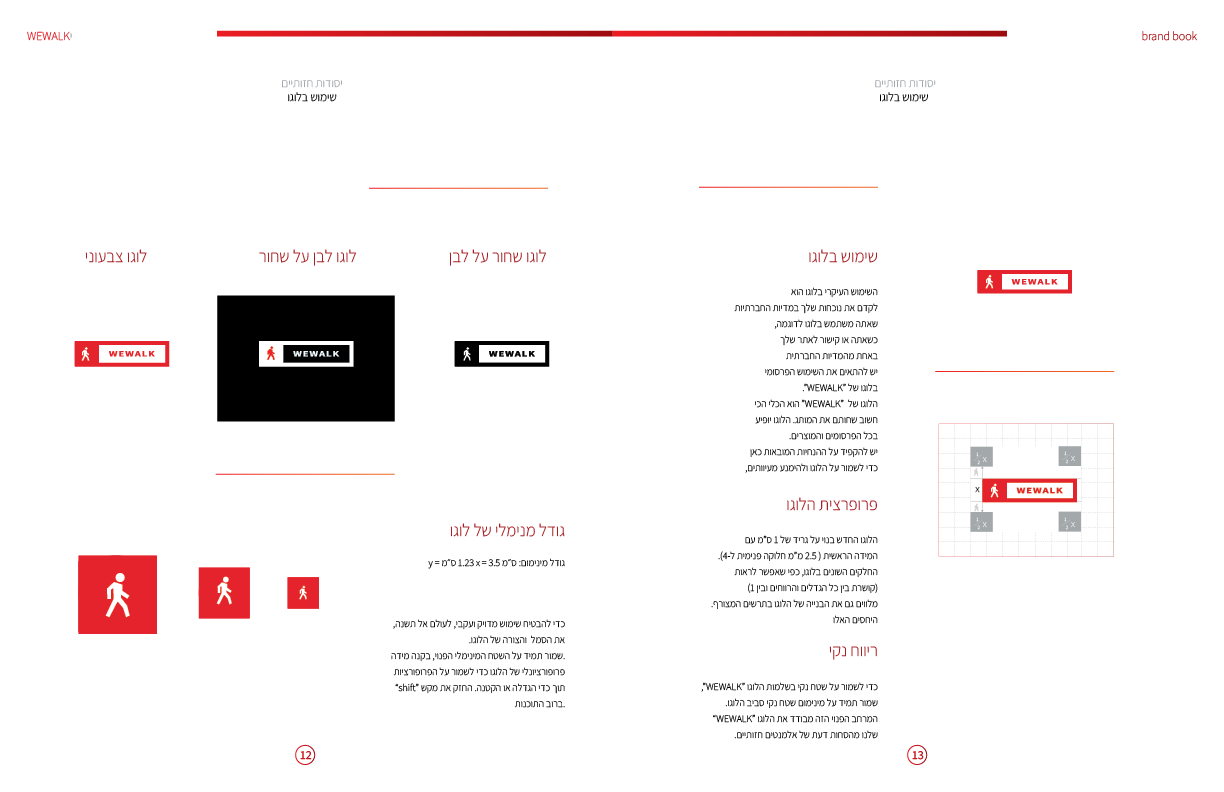
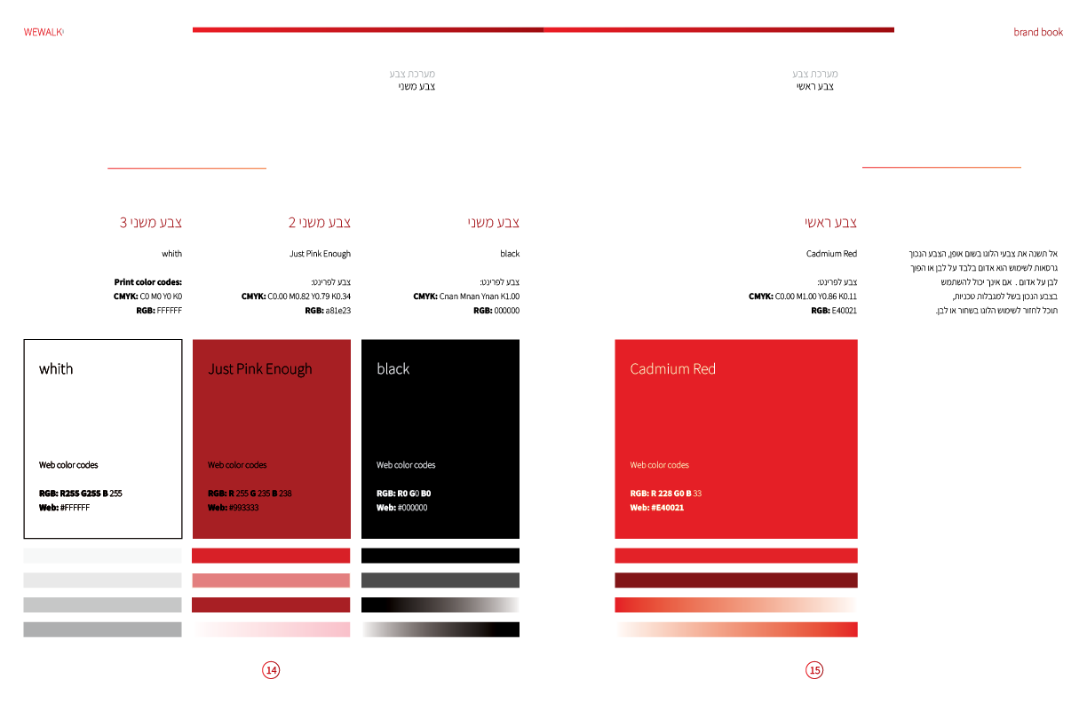
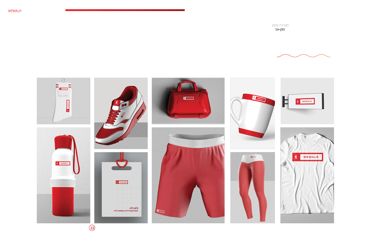
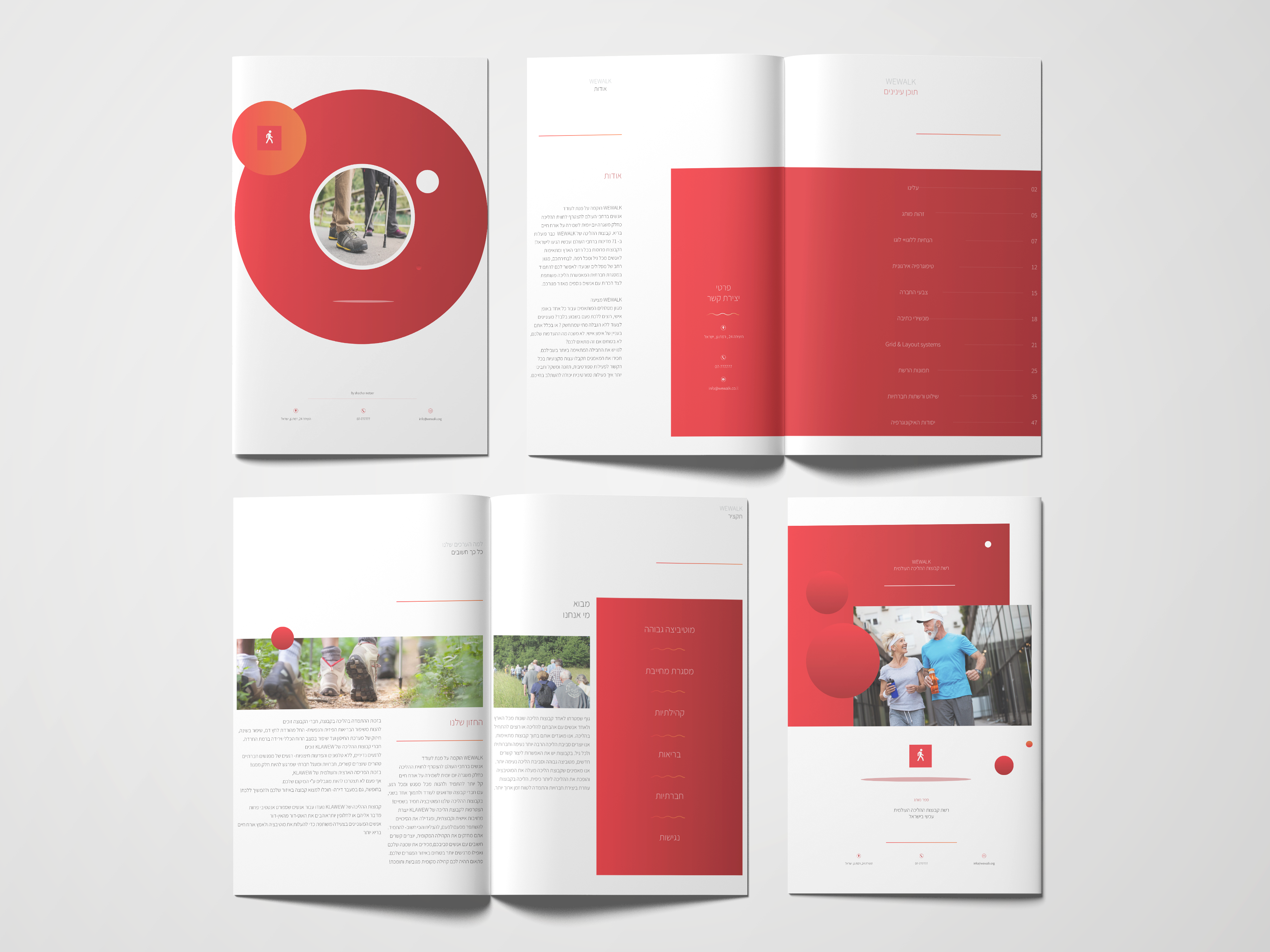
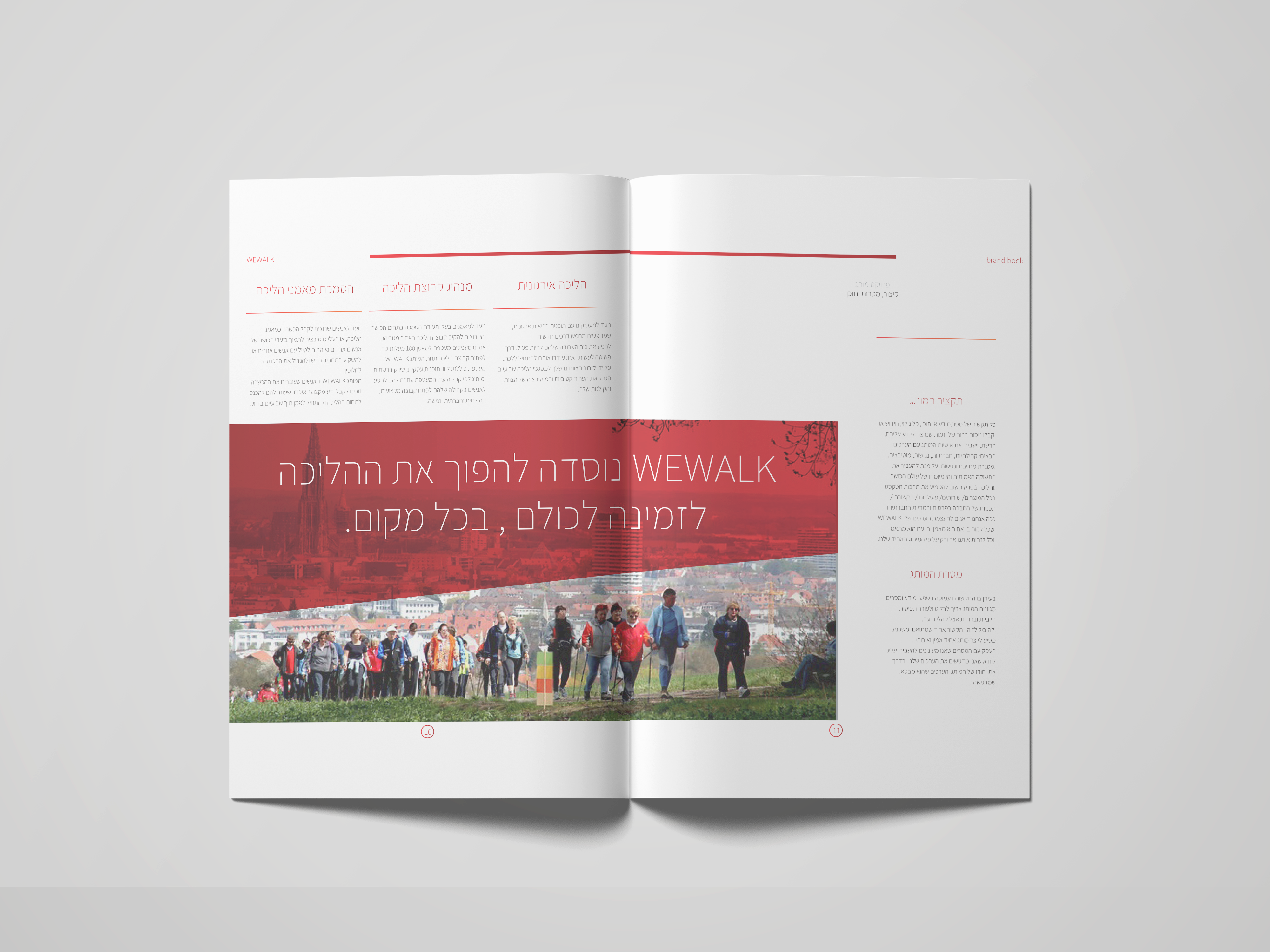
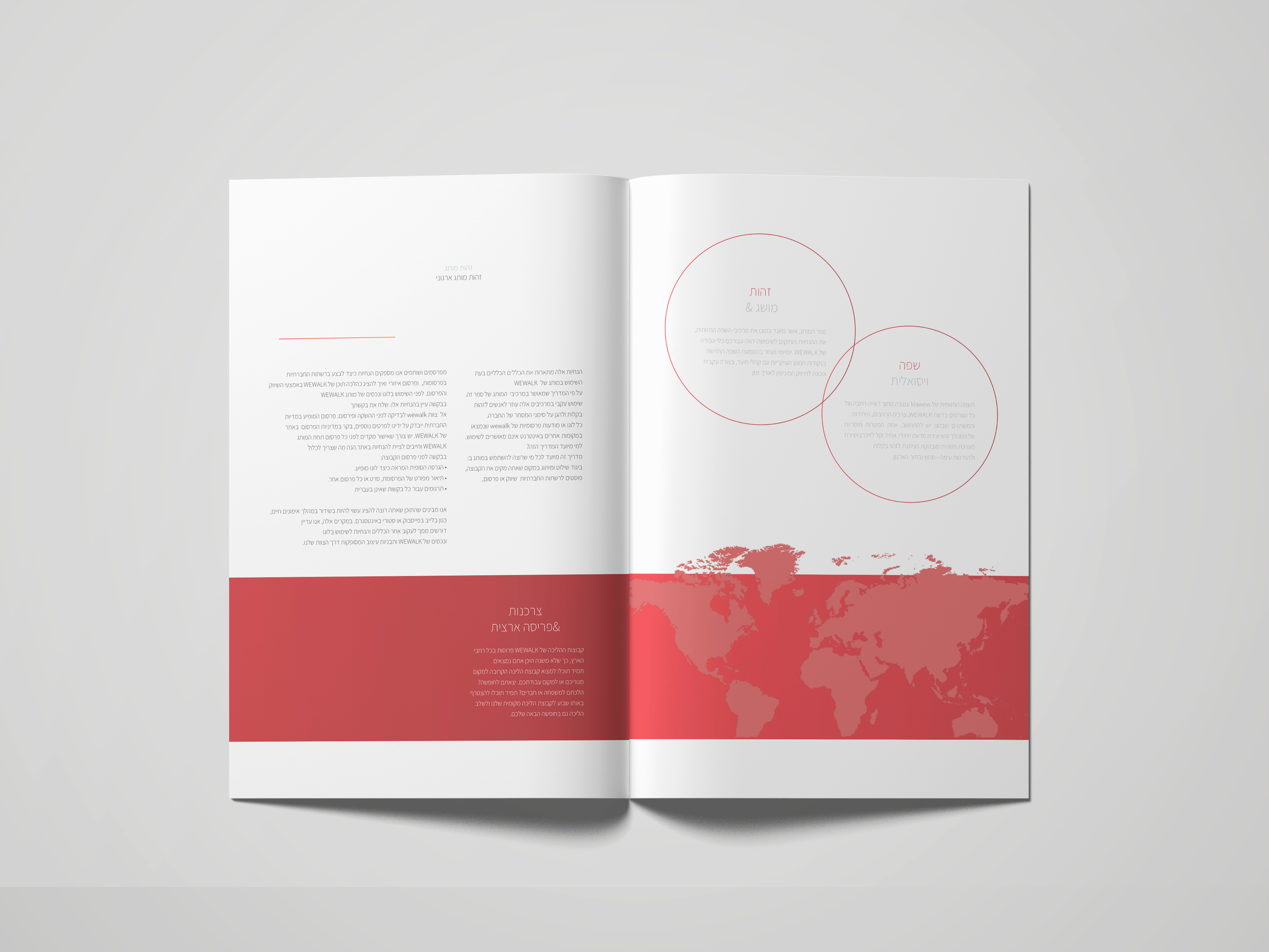
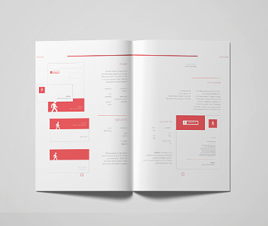
The process involved developing a visual identity system that reflected the ethos of WEWALK. This included a clean and dynamic logo, a vibrant color palette, and typography choices that balanced energy with legibility. Focusing on creating an intuitive layout with a clear hierarchy of messages, ensuring unity in the brand story.

Business Challenges

Establishing a visual identity that stood out in the competitive fitness and wellness market was a primary challenge. Additionally, the brand needed to serve as both a promotional platform and a functional tool, requiring a careful balance between aesthetics and utility. Ensuring that the design could scale as the brand grew added another layer of complexity.

Outcome

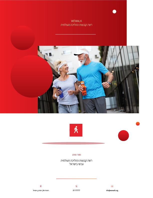
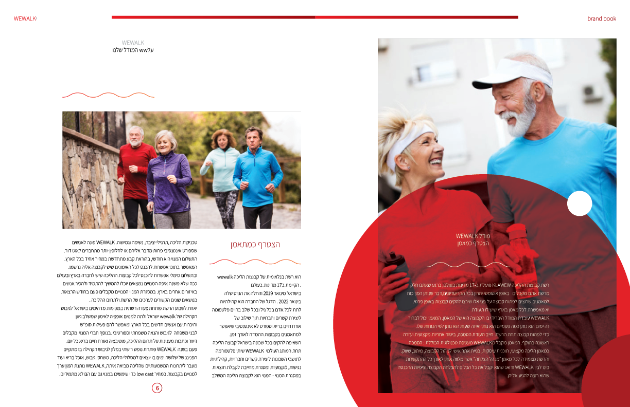
The final visual identity successfully encapsulated the values ​​of WEWALK, creating a recognizable and inspiring brand presence. The design provided a clean and consistent line, making it easy for visitors to identify the brand, want to be a part of it and join walking groups. After unifying the design, a large flow of new customers began and we received a lot of positive feedback from stakeholders, confirming the success of the project in establishing a strong foundation for WEWALK’s identity.
Takeaways

This project highlighted the importance of aligning visual design with brand values ​​and the needs of the business and customers. It demonstrated the power of cohesive branding to tell a compelling story while providing practical functionality. Working on the visual identity and design of WEWALK deepened my understanding of creating designs that are both aesthetic and customer-centric.